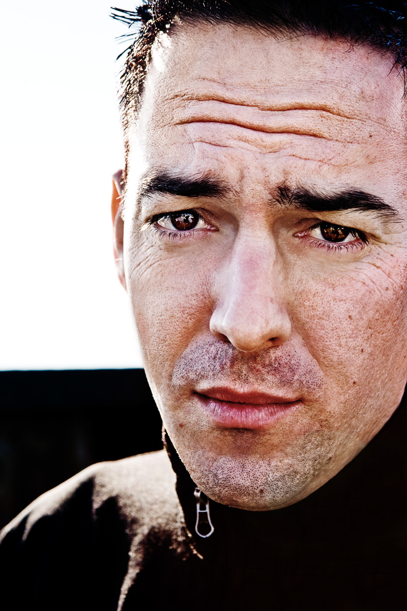
Jonathan Gorman - Drummer, Artist, Creative / Studio Roof October 29, 2007
Do I like it? No! I'm trying to figure out why not. Maybe it is the overexposure of the highlights and the background. Maybe it is the wrinkled forehead. I thought, "Aha! New Jersey," but that isn't the case from his name and short description. Even so, the expression or the image doesn't say Artist/Creative. I guess it should for this to be a good portrait. I stared at the eyes for a while. There is an intensity there. I guess I still don't like it. Sorry. - John Andrews oooh, I like it, definitely. the brooding, misunderstood, even slightly sad expression is just lovely, complex. and the colors - or lack thereof - are great ... the detail in his skin is so tangible. - zed - http://www.zaedryn.com What a face. I like that the background is blank/white and makes you focus on only him. To me there's a lot in his eyes. - thymiane3000 - http://chiaroscuro-photo.blogspot.com/ i think the eyes say alot. I like the photo. - Tina gritty and real. lovin' it. - carolyn - www.carolynannahall.blogspot.com I know why I don't like it - because it's cut too close (for my personal taste ). If there were more hair, more of the missing side of his face I think I would probably like the portrait quite well. There is something intriging about the expression. - Iris Looks like Richard Gere's kid. If I were a hot chick I might want to do him, but since he's my little brother I'll prefer to just kick his ass the next time I see him...
-Fam - Matt Gorman hehe... matt... that's what big brothers do, and that's what they're here for! it's just another way of saying: 'i'm proud of you'! - samsplanet He's just sad that he's about to get my bXXXX on his chin.....again.
**** dirty boy. Now I've got to censor you. -bw<br /><br /><i>Edited By Siteowner</i> - Willy Marbles ...I didn't mean to say that out loud...oops - Willy Marbles i love this. the pained artist. that's what this portrait says to me. LOVING it. - story - prettylittlemess.wordpress.com a bit unflattering, but I like that about it. - Erin very James Dean. very cool. - I dont like it, sorry. It's too stationary. And he kind of looks like he's going to be sick. - Rebecca Levitan Botox, he needs it. Really sexy guy, though. I bet he's hot when he doesn't look sick. Great photo. - hp i do like how his face is shown in all its weathered glory - pores, stubble, wrinkles, etc. ... and the sharp clean horizontal line across the background (b&w) is a nice foil to the texture of his face and hair. i'm not "feeling" it though. maybe it's the expression. he looks a little upset and i think that is why viewers feel upset too. - Mindy At first glance, this portrait had something that caught me. They eyes
definitely grab you. But then as I looked at it more, they looked just a
tad sad and didn't instill "artist/creative" in me. While the wrinkles in
his forehead are part of him, it's a part that is too distracting for a
portrait. They should have been minimized; the blown out nature and the
contrast also just deepens the wrinkles. But it's the fact that his head
looks too big for his body...that is the something that kept bothering me
(and this just makes those wrinkles stand out even more). Not sure if it's
the cropping on the head, or the angle of the head to the body, or the lens
that was used, but the head seems out of proportion and distracts.
This one detail ruins it for me. Changing that and minimizing the wrinkle
would make it work. - latoga - www.latoga.com
I'm Bill Wadman, a New York-based photographer who after completing my first 365 Project, and then a weekly 52 Project, took it upon myself to shoot and post one portrait every day of 2007. Each photo was taken that day, and each day was a different subject. Some were be in the studio, some in the wild. Hopefully they are all interesting.
365 Portraits - The Book is now for sale on Blurb - Order Now!!

- John Andrews
oooh, I like it, definitely. the brooding, misunderstood, even slightly sad expression is just lovely, complex. and the colors - or lack thereof - are great ... the detail in his skin is so tangible.
- zed - http://www.zaedryn.com
What a face. I like that the background is blank/white and makes you focus on only him. To me there's a lot in his eyes.
- thymiane3000 - http://chiaroscuro-photo.blogspot.com/
i think the eyes say alot. I like the photo.
- Tina
gritty and real. lovin' it.
- carolyn - www.carolynannahall.blogspot.com
I know why I don't like it - because it's cut too close (for my personal taste ). If there were more hair, more of the missing side of his face I think I would probably like the portrait quite well. There is something intriging about the expression.
- Iris
Looks like Richard Gere's kid. If I were a hot chick I might want to do him, but since he's my little brother I'll prefer to just kick his ass the next time I see him... -Fam
- Matt Gorman
hehe... matt... that's what big brothers do, and that's what they're here for! it's just another way of saying: 'i'm proud of you'!
- samsplanet
He's just sad that he's about to get my bXXXX on his chin.....again. **** dirty boy. Now I've got to censor you. -bw<br /><br /><i>Edited By Siteowner</i>
- Willy Marbles
...I didn't mean to say that out loud...oops
- Willy Marbles
i love this. the pained artist. that's what this portrait says to me. LOVING it.
- story - prettylittlemess.wordpress.com
a bit unflattering, but I like that about it.
- Erin
very James Dean. very cool.
-
I dont like it, sorry. It's too stationary. And he kind of looks like he's going to be sick.
- Rebecca Levitan
Botox, he needs it. Really sexy guy, though. I bet he's hot when he doesn't look sick. Great photo.
- hp
i do like how his face is shown in all its weathered glory - pores, stubble, wrinkles, etc. ... and the sharp clean horizontal line across the background (b&w) is a nice foil to the texture of his face and hair. i'm not "feeling" it though. maybe it's the expression. he looks a little upset and i think that is why viewers feel upset too.
- Mindy
At first glance, this portrait had something that caught me. They eyes definitely grab you. But then as I looked at it more, they looked just a tad sad and didn't instill "artist/creative" in me. While the wrinkles in his forehead are part of him, it's a part that is too distracting for a portrait. They should have been minimized; the blown out nature and the contrast also just deepens the wrinkles. But it's the fact that his head looks too big for his body...that is the something that kept bothering me (and this just makes those wrinkles stand out even more). Not sure if it's the cropping on the head, or the angle of the head to the body, or the lens that was used, but the head seems out of proportion and distracts. This one detail ruins it for me. Changing that and minimizing the wrinkle would make it work.
- latoga - www.latoga.com